So I write this as a longtime iPhone user, who went to the Apple Store in Pasadena the day after it was released, and bought the original iPhone as a wedding present for my fiancé. I then spent the next three years borrowing it, since I was so glued to my desk, I didn’t see a need for owning a cell phone myself.
(Once the iPhone 4 came out, I couldn’t resist any longer, bought one immediately, and upgraded to the 4S when it came out, mostly for the improved camera. Love it.)
Android phones never managed to capture my interest. They just looked and felt like bad photocopies of the iPhone, and didn’t offer anything new I was interested in, like the ability to install a custom theme that looked even uglier than the default, or download torrents on my phone, or play a Matrix animation in the background, or remove my battery, or spend time killing random processes, or over-clock my CPU, or any other beardy sort of thing. (Seriously, if I could remove my battery, I would misplace it in less than five minutes.)
When Windows Phone 7 was released, I was intrigued by the design and typography, but I didn’t get to play with it until my brother bought one and raved about it. My initial impression (this was pre-Mango) was lukewarm, and I was obsessed with the iPhone at that point anyway, so I just went all fanboy on his ass and mostly ignored it.
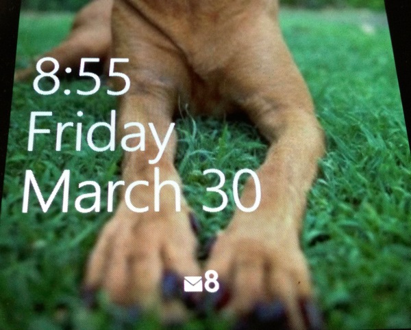
Fast-forward to this January, I ordered a second hand Samsung device to help with development, and promptly fell in love with it. Why? Let me count the ways: First of all, it was new and different. As much as Android felt like (poorly) recycled ideas and bad new ones, Windows Phone felt original, well designed, and fun to use. The performance was great, really smooth in a way iOS is and Android isn’t even in ICS. The “pivot” and “panorama” UI concepts were fresh and a great way of making good use of a small screen in portrait mode. The typography was clean and brazen. The integration of Facebook and Twitter made them feel like first class citizens, not an afterthought. The live tiles on the home screen were a great way to make the phone feel alive.
Just as important, though, was how I felt going back to my iPhone after a week of using the Windows Phone almost exclusively: obviously the iPhone has a far better camera and much better photo software, and for that reason alone I wouldn’t abandon it. But the iPhone felt staid, for lack of a better word. I wanted to be able to pin a few email folders to my home screen and watch them update live. I wanted to see all my social updates in a more integrated way. I missed being able to go to a contact (which I could also pin to my home screen), and easily see the conversations (Facebook, or SMS) I was having with them, and recent photos they’d uploaded.
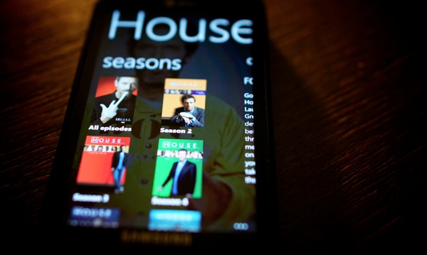
My conclusion is a bit bifurcated: If you’re looking for a mobile device that’s not iOS, you should really check out Windows Phone, especially on the sexy new Nokia devices. And Apple, please integrate social services more closely, and do something cool with the home and lock screens, which are getting boring after 5 years.
Anyway, that was a really long tangent, which took almost as long to write as Plex for Windows Phone, which brings me to my next point. Platforms face two ways, towards the users, and towards the developers. The iOS development environment is quite good, with the weakest link being Objective-C, which has a steep learning curve and feels like it stepped out of the 80s with a cocaine hangover.
Android, oh, Android, I don’t mean to pick on you once again, but your edit-build-deploy cycle is long enough to make a grown man cry, and then stab himself in the eyeballs, and then cry some more. Java is fine, but the surrounding environment and piss-poor emulator makes it much harder to develop for than it should be.
So how is the Windows Phone development environment? It’s scary good. C# is a great language, .NET is a solid framework, XAML is a really nice way to design user interfaces, and the edit-build-deploy cycle is fast. It still has a bit of growing up to do, but the proof, as they say, is in the pudding: we were able to write the app from start to finish in two months, between two engineers working part time, which is almost an order of magnitude faster than it took for the iOS and Android app. This sounds impossible, but trust me, it’s incredibly productive. (And as the last one out of the gate, it *needs* to be productive if the platform is to gain the apps it needs.)
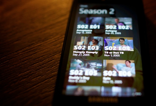
My last thought on Windows Phone is that it’s got all the ingredients it needs to be successful: It’s a fun, useful, well-designed platform, with sexy (Nokia) hardware, and it’s as good for developers as it is for users. It deserves much more marketshare than it has, and Microsoft seems to be making most of the right moves (about time). We’ll see how it all works out.
All that to say: Hey, Plex for Windows Phone 7 is now available in the App Store! (Well, it should be shortly, it says it’s live but apparently it takes a little while to actually show up.) Make sure you’re running the new 0.9.6 beta of the Plex Media Server, which includes Silverlight Smooth Streaming support.
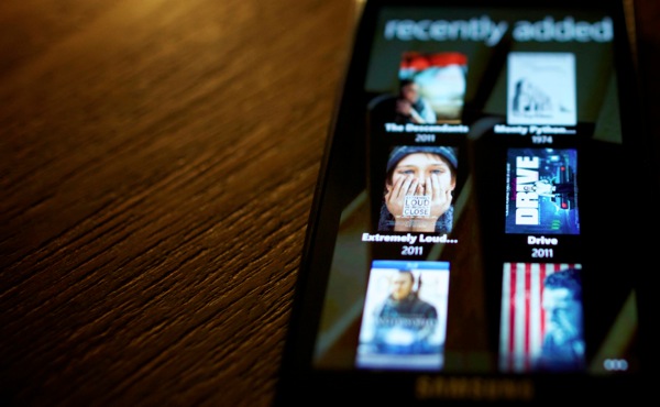
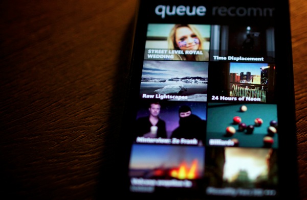

We hope you love it.
(OK, so I just *know* some smart alec is going to make a comment about “all twelve Windows Phone 7 users” really appreciating this release, and I should warn you: we know who you are, and any such commenter will find that Plex will start overlaying black bars over any videos with nudity. In the right places. No, really. It’s patent pending and we call it the deboobifier.)
