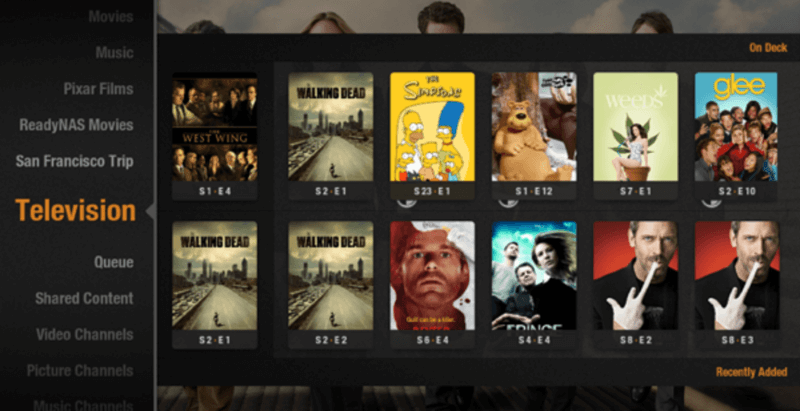
From the beginning (A Long Time Ago), we have been passionate about user experience, and we’ve always tried to come up with innovative ways for you to interact with your media. It’s hard to believe it was almost 6 years ago when we introduced the On Deck feature, which gives you quick and efficient access to media by episode.
Laika: Plex app and space dog
On Deck was our first foray into what we call media discovery, where we try to find the golden needles in your media haystack, making it quick and easy to get to what you care about (e.g. the next episode in a TV series, or the movie you fell asleep watching the night before). In subsequent years, we’ve been working to bubble up other media suggestions, such as a show with new episodes you haven’t watched in a while, or an album you had on heavy rotation a few months ago. For most people, media discovery is great: it means that you never need to leave the home screen to find the next thing you want to watch or listen to. (And of course with post-play, you might never even need to go back to the home screen in the first place! Plex: The reason you were up until 4 a.m. watching Dr. Zoidberg wax poetic over unrequited crustacean love.)
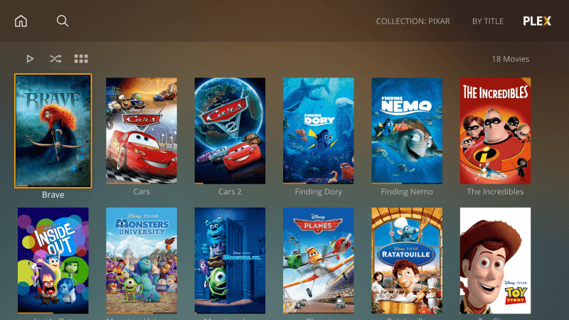
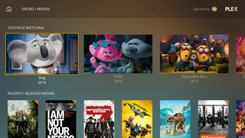
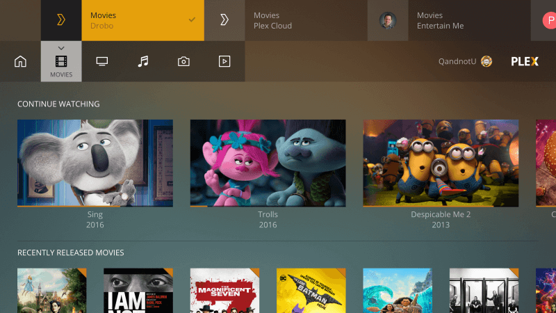
However, we’re keenly aware that all of our beloved Plex users weren’t cast from the same mold. Plenty of you want a simple, no-nonsense way to find a singular movie or TV show and play it with a minimum of fanfare. OR just scroll through their entire movie collection, page by page, to impress their dates (swipe right, scroll down!). Well, now you can finally rejoice: the brand new v2 UI means you’re no more than a click or two away from browsing your entire library. No need to pass Go, and (unfortunately?) no collecting $200.
A consistent Plex experience is also something we care deeply about. A few years ago, we (somewhat miraculously) got an XBox One app built (side note: we then hired the Microsoftie who helped us), and we fell deep and hard for the giant-posters-and-horizontal-navigation thing. The early Xbox One apps were trailblazers in their own right, but suffice to say that we were all searching for answers on the cusp of the next evolution of big-screen media apps.
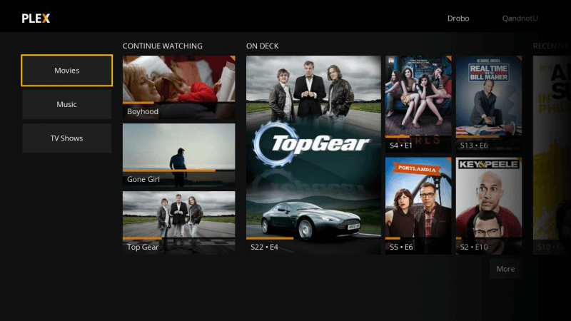
My god, it’s full of giant posters
The approach was beautiful in its simplicity: Lovely compositions built from your own media library! Giant thumbnails of your sex tapes (on certain unfortunate occasions)! Fields of [•••] buttons as far as the eye could see!
But it turns out there was a dark side…
There were clear issues with information density and click efficiency. Movie trailers languished in obscurity. Your favorite sources for media, especially across different servers, were often hard to get to.
In the meantime, we grew our UX team, and started doing real live “intimidation-based” user testing (the kind with one-way mirrors and ex-KGB handlers. Well, maybe just screen recording and kind volunteers, but that doesn’t sound nearly as cool.)
So back to the lab we went, and like Frankenstein with his monster…actually, that’s a terrible simile. Like the Manhattan Project with…nope, still not quite right. Like a postgraduate Chem student making meth in her bathtub, we sharpened our pencils, flipped open our notebooks to the first clean page, and got to work trying to appease our thesis advisor. (That’s you, everybody. Just go with it.)
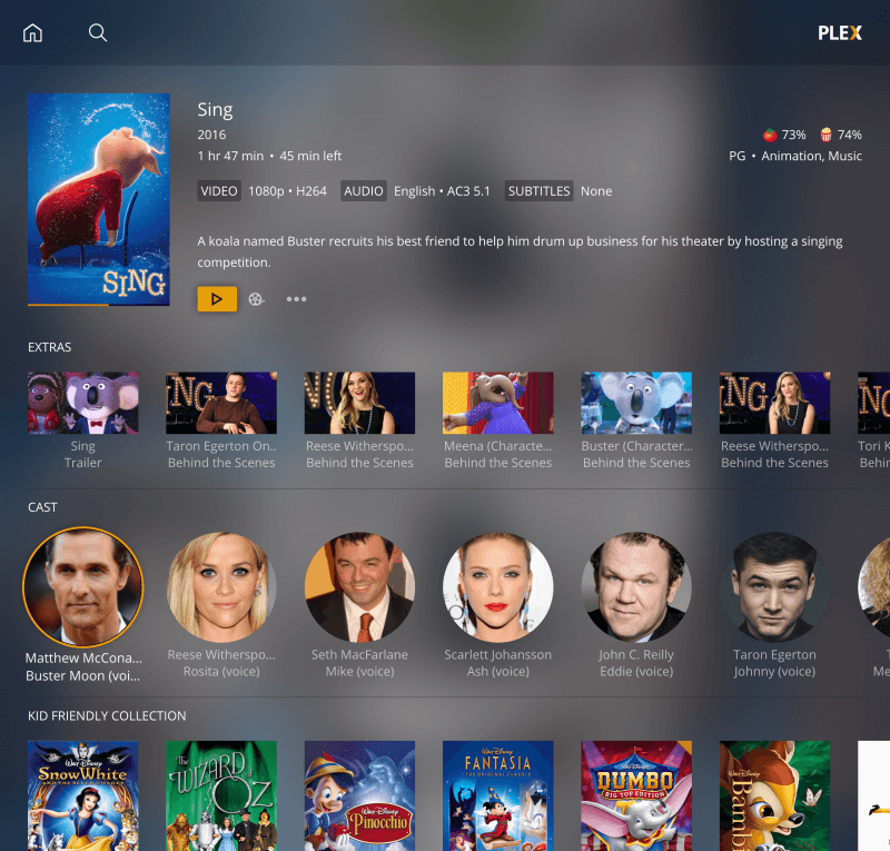
We think this new approach is a great improvement for all of our users. Do you love and live by the discovery sword!? You’re covered. Do you prefer to browse your meticulously-curated movie collection in order and choose exactly what you want to watch? Also good to go, without wasted clicks. The new UI even adapts as you consume different types of media from different sources — no more switching “servers” between your own photos and your favorite hipster friend’s music library (weird that he refuses to add that new Arcade Fire album, no?)!
See, it turns out Lydgate was full of shit: you CAN please all of the people all of the time. (Well, at least when it comes to two semi-conflicting modalities of media browsing.)
So without further ado, rest your weary eyes on some of this delicious, gluten-free eye-candy. This new interface is currently available in the Plex Pass preview version of Plex Media Player (don’t worry, it will be available to all our other users soon, too). Need more information? Find out more about Early Access and Preview Releases.
We’re working hard to bring this to all of our other platforms, so please, play with it and let us know how you like it. We love hearing from you!

Barkley wanted to stay in and be a couch potato:

