Ahoy! As many of you know, our goal at Plex is to create the most elegant way for you to find, discover, and enjoy that perfect movie or TV show at the perfect time. To that end, we’re always taking a hard look at our app designs and constantly figuring out how to improve the experience and interface. Basically, we’re our own harshest critic (don’t worry, we’re going to tons of therapy to deal with the guilt 😜).
The Dream
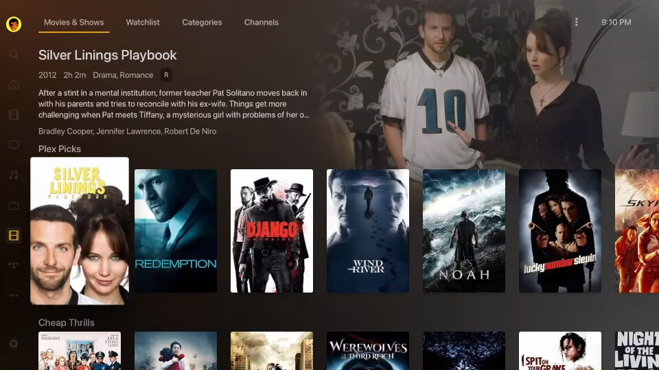
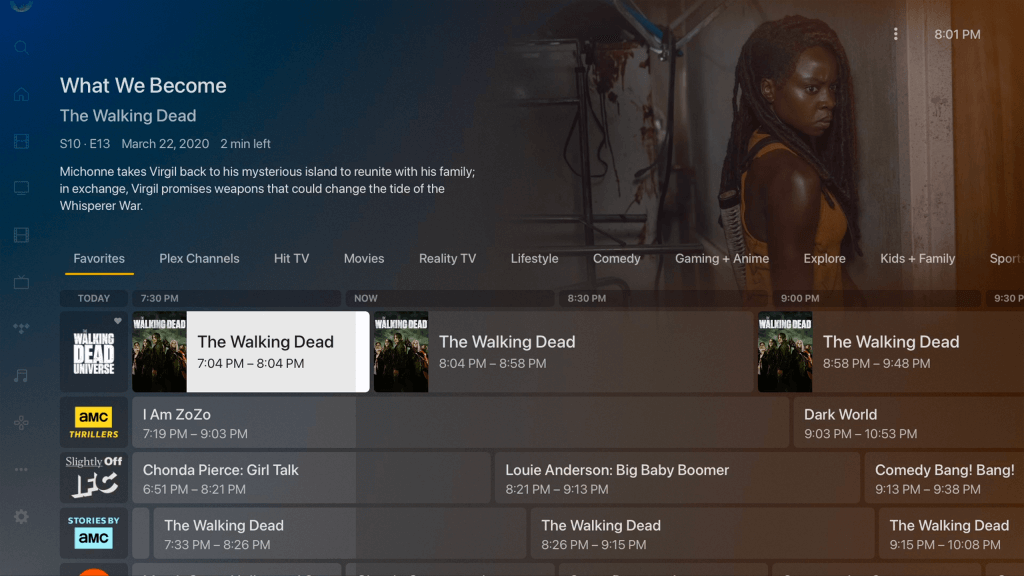
We love movies and shows. And just as importantly, we love the artwork for movies and shows – the posters, the graphics, the typefaces, the colors. For quite some time we’ve been eager to update the layout of our TV apps in order to further embrace the use of artwork and color of the featured movie or title – basically to make an elegant frame for the content you love. Our goal is to place the movie artwork front and center and have the UI enhance–rather than compete with–the poster art. In addition, we wanted to provide users more information (metadata) about the focused title at a glance in order to make finding the perfect movie or show faster with fewer clicks.
The Complication
Sounds pretty straightforward, right? Well our challenge is that since Plex is used by so many different types of users (a great problem to have!), each one of you has different habits and desires and styles as well as a vast variety of TVs with different resolutions and brightness and contrast ratios. So how do we ensure we offer the best experience for as many of you as possible? And build a dynamically responsive system that pulls visual styling from millions of different pieces of art? Turns out, the solution was not something we could pull off all by ourselves. So we got a little help from our friends.
The Flashback
We know that any changes to a long-standing user interface can be challenging for users to adjust to. This is especially true here at Plex, where we have such a passionate and engaged community (if you’re reading this, you know who you are!). We also have the great fortune of knowing how to do it the wrong way (ahem, we’ve had a few, shall we say, “rough” UI transitions in the past) and have re-tooled our approach to make this UI evolution a better experience for our users by gathering feedback as early as possible.
The Approach
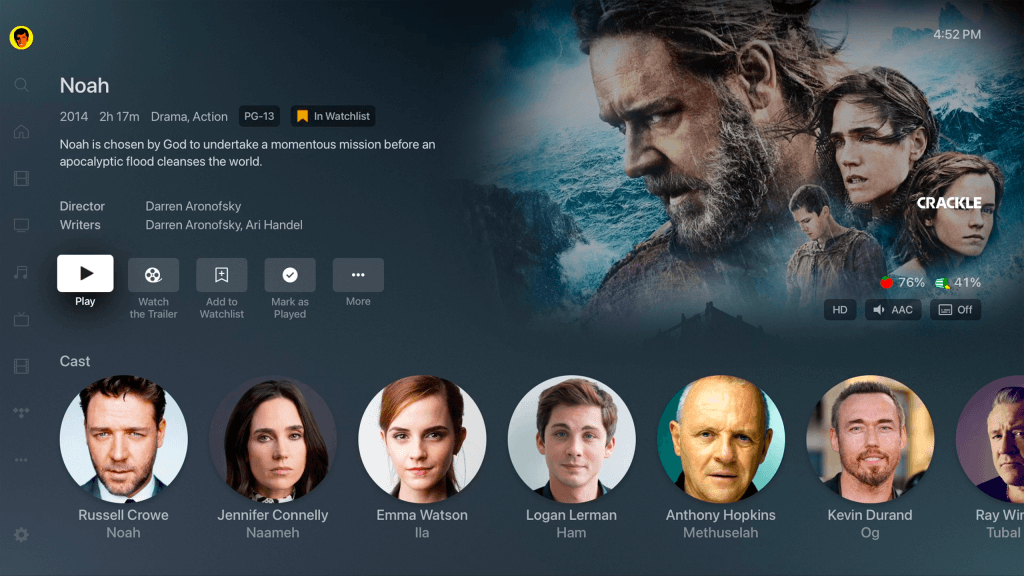
First, we explored a large number of layout options, eventually landing on a new “Modern” layout that would showcase artwork from the title and provide some additional context when a poster is in focus: genres, parental ratings, and brief synopsis of the title without having to first click. We combined this rich data with a background color extraction process with a goal of providing a more immersive and streamlined experience when you’re sitting down at the couch and trying to figure out what to watch. Since posters generally have the movie or show title contained in the artwork, this layout also forgoes duplicating the (often truncated) text titles and additional information below the poster in favor of displaying that information in the “inline metadata” section at the top. Importantly, we wanted to involve the Plex community in the process and invite you into the lab.
The Experiment
To make the collaboration a reality, we took advantage of our existing “experimental features” opt-in program. This allows users to virtually “raise your hand” and volunteer your time and attention to participate in various experiments we are running in our apps. For this project, we invited our test users to try out the new UI available in several of our big screen apps.
As the experiment ran over several weeks, we closely followed the feedback that was provided by the users as they posted in our forums. Well over 350 (and counting!) comments were made on the experiment topic, providing a wealth of constructive feedback, ideas, and discussion.
The Feedback
After we allowed users to play with the initial experiment for a while, we reviewed all the feedback back in the design studio, finding common themes (contrast issues, badging concerns, type sizes, etc.). From this feedback, we were able to make several adjustments to the app experiment and get changes out to our test users for additional feedback.
This active engagement on both sides has landed us in what we believe is a much better experience for everyone. We opted for a more personalized experience (a crucial part of the Plex DNA) and worked hard to provide the right mix of options for our diverse community of Plex users and devices.
The Results
So what does that mean for you? If you’re on a Roku or Apple TV (with others following shortly), now you can visit the Settings > Experience section of supported TV applications and try the following options on for size.
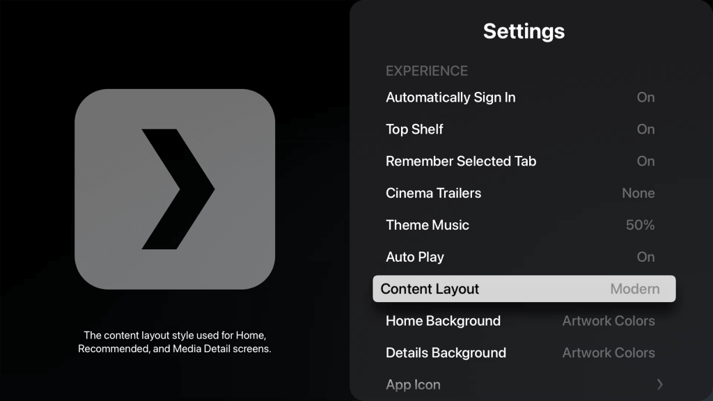
- Content Layout:
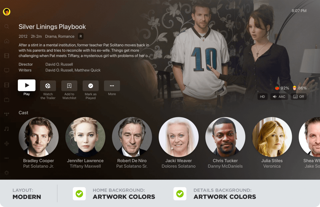
This setting controls the layout used to display your content. Okay, so before you say “No, duh!”, this setting also controls whether “inline metadata” is displayed on the homescreen and the poster is displayed on detail pages.- Modern (the default): Displays artwork and “inline” details about the title on some screens when focused on a poster. This layout also prefers background artwork over posters on title detail pages.
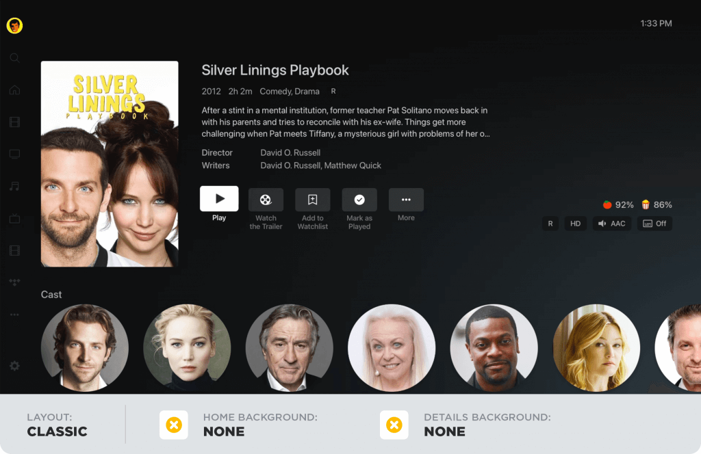
- Classic: No “inline” metadata is shown, displays title and additional information below posters, and prefers posters to artwork on detail pages.
-
App/Home Background:
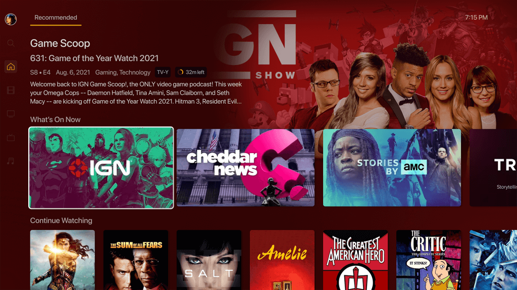
This setting allows the user to select the base background of the app (i.e.: the background used for the home screen, settings, etc…).- Artwork Colors (the default): Applies colors from the current title’s artwork to the background and gracefully (we hope!) transitions the colorfield as the title selection changes.
- None: Displays the default background for the application (dark gradient).
-
Details Background:
This setting controls the background displayed on the detail pages for items.- Artwork Colors (the default): Utilizes colors from the title’s artwork within the background on title detail pages.
- Dimmed Art: Displays a full screen, dimmed version of the background artwork on detail pages.
- None: The default background for the application is used for detail pages (dark gradient).
When we step back, the thing we heard most consistently from this process is that our users want choice—the power to control your own viewing destiny. The beauty of providing three independent settings is that you can try out different combinations in order to deliver the best experience for you.
The Rest is Up to You!
Now you get to choose your own display adventure. Here are some recipes for you to try out. (Don’t worry, the defaults are pretty snazzy right out of the box.)
Do you want a fully immersive experience that breathes and adapts as you move through content?
Or would you prefer a high contrast, poster browsing, simplified experience?
Or anything in between. Let your imagination go wild!
So again, thank you to all our users who provided such thoughtful feedback. With your help, we were able to modernize our design while maximizing variety and choice. You folks came up with so many great ideas—a few of which we’re actively exploring as we speak. So stay tuned and look out for even more personalization options and quality refinements. As they say in the moving pictures, the best is yet to come.
Modern Layout is available today on our Roku and Apple TV apps (make sure you have the latest update installed), and will soon be available for Android TV, with other platforms following shortly thereafter.
Have you tried Modern Layout yet? What’s your favorite combo of settings? Share your thoughts and suggestions below!
